Mobile app design survey - example of the analysis
Introduction
Hello! Long time no see. The fact is that my blog is slowly dying. It will be difficult for me to stop this trend due to the increasing number of professional and personal obligations. Recently, I conducted several surveys at work. I thought it would be a good idea to prepare a quick post showing how to analyze the results of simple surveys using iPython notebooks.
Let’s get to work!
PS. I know this is another post about a pregnancy-related app. I just work with similar apps in my professional life.
Context
Since I work professionally with mobile applications, the context of this survey will also involve a mobile application. Let’s imagine we have an app that helps pregnant women. It has three main functionalities:
- Articles with various categories of content,
- Baby development preview for the current week of pregnancy,
- Pregnancy planning (such as helpful lists, a calendar, or adding health metrics).
The app has been stagnant for some time, maintaining a stable user base but not growing. Users are showing less interest, and new users quickly abandon the app. Your design and product team has asked you to conduct a survey among app users to determine the app’s strengths and weaknesses to address the issues and guide further development. This is the first survey conducted among app users, so it should be very preliminary, not asking too many complicated questions.
Considering all the requirements and suggestions from your colleagues, you prepared the following survey flow:
Demographics
Current Pregnancy Trimester
- First
- Second
- Third
Age
- < 18
- 18-24
- 25-34
- 35-44
- 44+
Functionality assessment
Other Pregnancy Apps Usage
- Yes
- No
App Functionality Usage
- Daily
- Several times a week
- Once a week
- Less frequently
Most Important App Feature
- Articles
- Baby development by week
- Pregnancy planning (calendar, checklists, health tracking)
Article Feature Satisfaction
- Very satisfied
- Satisfied
- Neutral
- Dissatisfied
- Very dissatisfied
Most Important Article Categories (Select up to 3)
- Baby
- Mom
- Helpful tips
- Nutrition
- Childbirth classes
- Expert advice
- Learning
- Partner
- Facts
- Inspiration
- Relaxation
- Shopping
- Useful links
- Clothing
- Lifestyle
- Research
- Planning
- Self-care
- After childbirth
Baby Development Feature Satisfaction
- Very satisfied
- Satisfied
- Neutral
- Dissatisfied
- Very dissatisfied
Pregnancy Planning Feature Satisfaction
- Very satisfied
- Satisfied
- Neutral
- Dissatisfied
- Very dissatisfied
Design Evaluation
- Overall app design rating (1 to 5)
- User interface intuitiveness rating (1 to 5)
Suggestions and Overall Opinion
- Any suggestions for app improvement? (Open response)
- Would you recommend this app to other pregnant women? (1 to 10 rating)
- What features would you like to see added in the future? (Open response)
The flow doesn’t seem complicated - all users will receive the same questions, with few open-ended questions, which are last and optional. After conducting the survey, you would like to return to the designers and product manager with answers to the following general questions:
- Which functionality is most important to users,
- How often users use the app,
- Whether there are dependencies between the most frequently chosen functionality and the user’s age or pregnancy trimester,
- The level of satisfaction with individual functionalities,
- Which article categories are the most popular,
- Whether the app has too many article categories to choose from,
- The level of satisfaction with the app’s design,
- Whether users for whom the app interface is less intuitive use it less frequently,
- The app’s NPS (Net Promoter Score),
- What users think needs improvement,
- What new features users would like to see added.
Of course, as with any research, additional questions and conclusions may arise during data analysis.
Generating Sample Data
The post is illustrative, so obviously, the survey isn’t real. Random answers to the questions will be generated using the numpy library. The random.choice method allows passing the probability of selecting a given answer. For demographic, open-ended, and app usage frequency questions, I will use this option based on what I think makes logical sense. I will also introduce several common errors or spelling variations in open-ended questions, such as double spaces, varying capitalization of first letters, or typos. Usually, we have to deal with them, so I am replicating these conditions. I will also artificially create dependencies, such as the most important functionality and pregnancy trimester, and the design rating and app usage frequency. I will also program distributions of positive and negative ratings for different functionalities. All this means that the answers will be quite predictable, which wouldn’t be the case in the real world, but the entry serves as an example. It won’t be perfect, but I think it’s enough for presentation purposes.
# Set number of samples
n_samples = 2000

# Generate sample data
frequency_of_use = np.random.choice(['Daily', 'Several times a week', 'Once a week', 'Rarely'], n_samples, p=[0.05, 0.2, 0.55, 0.2])

overall_design_rating = []
interface_intuitiveness = []

for freq in frequency_of_use:
    if freq == 'Daily':
        overall_rating = np.random.randint(3, 6)
        interface_rating = np.random.randint(3, 6)
    elif freq == 'Several times a week':
        overall_rating = np.random.randint(2, 5)
        interface_rating = np.random.randint(2, 5)
    elif freq == 'Once a week':
        overall_rating = np.random.randint(1, 5)
        interface_rating = np.random.randint(1, 4)
    else:
        overall_rating = np.random.randint(1, 3)
        interface_rating = np.random.randint(1, 3)

    overall_design_rating.append(overall_rating)
    interface_intuitiveness.append(interface_rating)

trimester = np.random.choice([1, 2, 3], n_samples, p=[0.3, 0.5, 0.2])
most_important_functionality = []
for t in trimester:
    if t == 1:
        func = np.random.choice(['Articles', 'Baby preview', 'Pregnancy planning'], p=[0.2, 0.1, 0.7])
    elif t == 2:
        func = np.random.choice(['Articles', 'Baby preview', 'Pregnancy planning'], p=[0.7, 0.2, 0.1])
    else:
        func = np.random.choice(['Articles', 'Baby preview', 'Pregnancy planning'], p=[0.2, 0.4, 0.4])
    most_important_functionality.append(func)

def generate_functionality_ratings(n, positive_bias=0.7):
    ratings = []
    for _ in range(n):
        if np.random.rand() < positive_bias:
            ratings.append(np.random.randint(4, 6))
        else:
            ratings.append(np.random.randint(1, 4))
    return ratings

data = {
    'Trimester':trimester,
    'Age': np.random.choice(['<18', '18-24', '25-34', '35-44', '>44'], n_samples, p=[0.05, 0.25, 0.4, 0.2, 0.1]),
     'Frequency_of_use': frequency_of_use,
    'Used_other_apps_before': np.random.choice(['Yes', 'No'], n_samples, p=[0.60, 0.4]),
    'Most_important_functionality':most_important_functionality,
    'Article_functionality_rating': generate_functionality_ratings(n_samples, 0.85),
    'Important_article_categories': [np.random.choice(['Baby', 'Mom', 'Helpful tips', 'Nutrition', 'Birthing class', 'Expert', 'Science', 'Partner', 'Facts', 'Inspiration', 'Relaxation', 'Shopping', 'Useful links', 'Clothing', 'Lifestyle', 'Research', 'Planning', 'Self-care', 'Post-birth'], size=np.random.randint(1, 4), replace=False).tolist() for _ in range(n_samples)],
    'Baby_preview_functionality_rating': generate_functionality_ratings(n_samples, 0.4),
    'Pregnancy_planning_functionality_rating': generate_functionality_ratings(n_samples),
    'Recommend_to_others': np.random.randint(1, 11, n_samples),
        'Overall_design_rating': overall_design_rating,
    'Interface_intuitiveness': interface_intuitiveness,
    'Improvement_suggestions': np.random.choice([
        '', 'more articles', 'Better graphics', 'faster load times', 'More interactive features', 'additional content categories',
        'improve navigation', 'more videos', 'better notifications', 'more language options', 'customizable themes', 'more frequent updates', 'less ads'
    ], n_samples, p=[0.7, 0.05, 0.05, 0.05, 0.05, 0.01, 0.01, 0.01, 0.01, 0.01, 0.01, 0.01, 0.03]),
    'Future_features': np.random.choice([
        '', 'daily tips', 'Exercise routines', 'Diet plans', 'Community forums', 'Expert Q&A sessions',
        'recipe suggestions', 'partner support tips', 'mental health resources', 'tracking multiple pregnancies', 'better calendar integration',
        'offline access'
    ], n_samples, p=[0.7, 0.05, 0.05, 0.05, 0.05, 0.03, 0.02, 0.01, 0.01, 0.01, 0.01, 0.01])
}


# Create DataFrame
df = pd.DataFrame(data)

# Convert lists in 'Important_article_categories' column to strings
df['Important_article_categories'] = df['Important_article_categories'].apply(lambda x: ', '.join(x))

# Function to introduce typos
def introduce_typos(text):
    if text == '':
        return text
    if np.random.rand() > 0.7:  # Introduce typos in 20% of cases
        # Add double spaces
        text = text.replace(' ', '  ', 1)
        # Change first letter to lowercase
        if np.random.rand() > 0.5:
            text = text[0].lower() + text[1:] if text[0].isupper() else text
        # Change first letter to uppercase randomly
        if np.random.rand() > 0.5:
            text = text[0].upper() + text[1:] if text[0].islower() else text
        # Add a random typo by repeating a character
        if np.random.rand() > 0.5:
            pos = np.random.randint(0, len(text))
            text = text[:pos] + text[pos] + text[pos:]
        # Replace letters with similar looking ones
        if np.random.rand() > 0.5:
            text = text.replace('e', '3', 1)
            text = text.replace('a', '@', 1)
    return text

# Apply the typo function to open-ended responses
df['Improvement_suggestions'] = df['Improvement_suggestions'].apply(introduce_typos)
df['Future_features'] = df['Future_features'].apply(introduce_typos)
Calling the head method on the dataframe should print a beautiful table:
df.head()
| Trimester | Age | Used_other_apps_before | Frequency_of_use | Most_important_functionality | Article_functionality_rating | Important_article_categories | Baby_preview_functionality_rating | Pregnancy_planning_functionality_rating | Overall_design_rating | Interface_intuitiveness | Recommend_to_others | Improvement_suggestions | Future_features |
|---|---|---|---|---|---|---|---|---|---|---|---|---|---|
| 2 | 25-34 | Yes | Once a week | Baby preview | 2 | Lifestyle | 2 | 5 | 5 | 2 | 2 | less ads | Expert Q&A sessions |
| 2 | 35-44 | No | Rarely | Articles | 3 | Shopping, Useful links | 3 | 3 | 2 | 5 | 10 | faster load times | |
| 2 | >44 | No | Once a week | Baby preview | 3 | Birthing class, Clothing | 4 | 2 | 2 | 4 | 1 | More interactive features | |
| 3 | 18-24 | Yes | Rarely | Baby preview | 2 | Facts, Baby | 1 | 4 | 2 | 4 | 1 | faster load times | |
| 1 | 35-44 | No | Several times a week | Baby preview | 3 | Inspiration, Facts | 2 | 4 | 4 | 3 | 7 |
In real survey conditions, the company might provide professional software for creating surveys, and the results would be collected in a much better form or automatically analyzed. Here, I assume a simple option with data transformation done manually.
Analysis
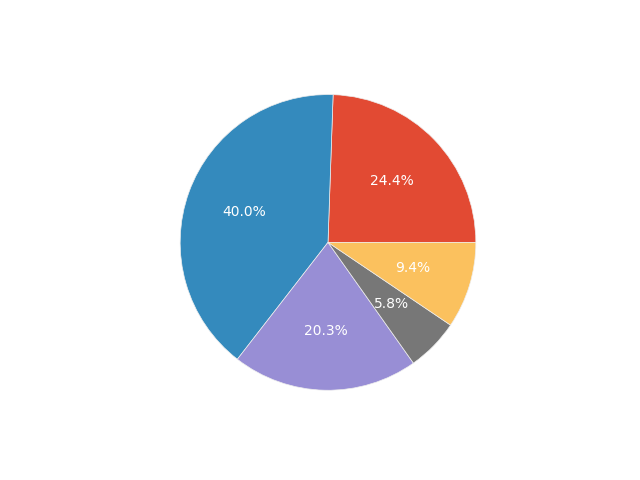
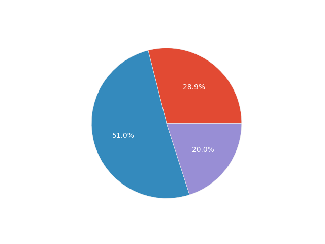
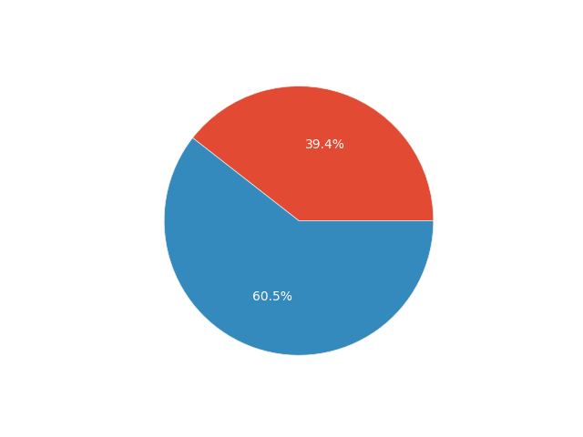
In survey research, it is helpful to begin by simply analyzing the data describing the surveyed population, as this provides a broader view of the respondents. Therefore, let’s create some simple pie charts with percentages for age, pregnancy trimester, and the question about using other pregnancy apps.
df.groupby('Age').size().plot.pie(y="Age", legend=True, autopct='%1.1f%%')
We can thus say that:
- The majority of the respondents (~40%) are aged between 25 and 34 years.
- Almost the entire surveyed sample is adult (~95%).
- The surveyed users are most commonly in their second trimester of pregnancy (~50%).
- 60% of the surveyed users have used other pregnancy apps.
Now, let’s move on to the main analysis to answer the previously posed analytical questions.
Let’s check the distribution of app usage frequency among users. We can use the same pie chart for presentation purposes.
# Frequency of use pie chart
df.groupby('Frequency_of_use').size().plot.pie(legend=True, autopct='%1.1f%%', title="Frequency of App Use")
plt.show()
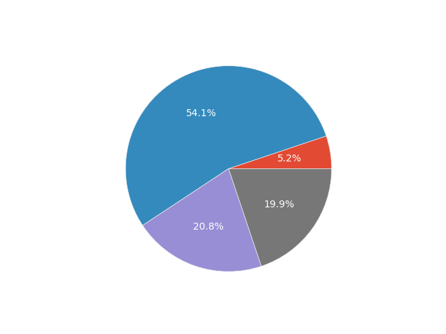
The vast majority of app users use it only once a week. Then, the proportions are roughly equal among users who use the app less frequently or several times a week. A very small portion of users visit the app daily. This may be an important finding for those working on the app’s content - they should try to make it offer something to users more frequently than once a week. Perhaps the app’s layout, clearly divided into pregnancy weeks, is a slight mistake and needs to be redesigned. Maybe push notifications should be created to remind users that there is still undiscovered content for the current week. There are certainly many possibilities, and finding these kinds of ideas is the responsibility of the design or product teams.
Now let’s look at the most frequently chosen most important functionality of the app.
# Most important functionality pie chart
df.groupby('Most_important_functionality').size().plot.pie(legend=True, autopct='%1.1f%%', title="Most Important App Functionality")
plt.show()
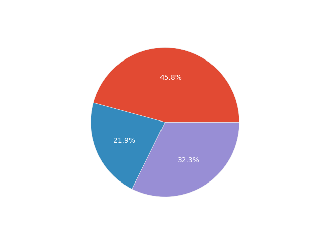
As you can see, articles clearly win. However, knowing that we have a wide variety of ages and pregnancy trimesters among users, it is worth checking whether these variables affect the chosen most important app functionality. To check whether categorical variables are dependent, we can use the chi-square test of independence. The null hypothesis of this test states that the analyzed variables are independent of each other. Let’s create a function that will allow us to perform a statistical test using the SciPy package. I’ll also draw a bar chart to better understand the data.
def chi_test(data_1, data_2):
    crosstab = pd.crosstab(data_1, data_2)
    stat, p, dof, expected = stats.chi2_contingency(crosstab)
    if p <= 0.05:
        print('Dependent (reject H0)')
    else:
        print('Independent (H0 holds true)')
    crosstab.plot.bar()
    plt.show()
Let’s see how the situation looks for age:
chi_test(df.Age, df.Most_important_functionality)
Independent (H0 holds true)
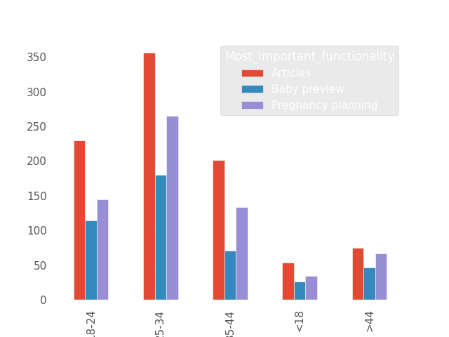
According to the test, the variables are independent. The chart seems to confirm this; the ranking of the most important function looks similar in each age group. Now, let’s look at the pregnancy trimester:
chi_test(df.Trimester, df.Most_important_functionality)
Dependent (reject H0)
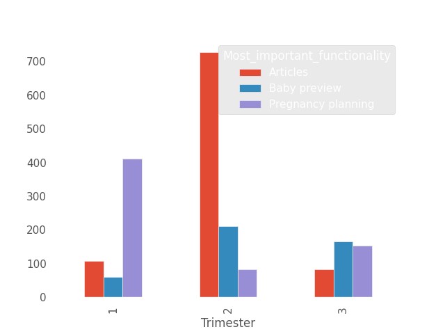
According to the test, the variables are dependent. Based on the chart, this can be observed. In the first trimester of pregnancy, the most important function is pregnancy planning, in the second trimester it’s articles, and in the third trimester, it’s baby preview. This could be an important conclusion; perhaps the app’s interface should be more tailored to the pregnancy trimester the user is in.
Let’s go through each functionality question of the application one by one, starting with the satisfaction level regarding the article view.
df.groupby('Article_functionality_rating').size().plot.bar()
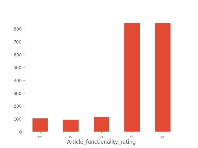
Users are satisfied with the article functionality, with most of them rating it as 4 or 5. In real-life scenarios, it would be worth checking if the rating significantly differs based on whether the functionality is critical to the respondent. However, in this artificially generated dataset, we assume independence from importance for each functionality.
Next, let’s create a ranking of the most liked article categories. This was a multiple-choice question, and responses are provided as comma-separated text. Hence, we’ll use the explode method from Pandas, which allows us to create a separate row for each item in a list. First, we need to create a list from the text using the standard split method.
df['Important_article_categories'].apply(lambda x: x.split(", ")).explode().to_frame().groupby("Important_article_categories").size().sort_values(ascending=False)
The result is a sorted ranking:
Baby              511
Post-birth        311
Relaxation        306
Helpful tips      289
Facts             234
Partner           182
Planning          165
Clothing          157
Lifestyle         153
Shopping          143
Research          120
Useful links       85
Birthing class     71
Mom                53
Nutrition          46
Inspiration        45
Expert             39
Self-care          30
Science            20
The most liked category is Baby. Generally, most categories are popular, but there are a few with very low scores, such as Science. My recommendation would be to conduct a deeper analysis here. Perhaps users are unaware of the existence of some categories. It would be valuable to check if the layout of different category articles in the application interface affects their popularity. If not, it may be advisable to reduce the number of categories, as maintaining so many may not be beneficial from a business perspective.
Let’s examine the ratings of the other functionalities.
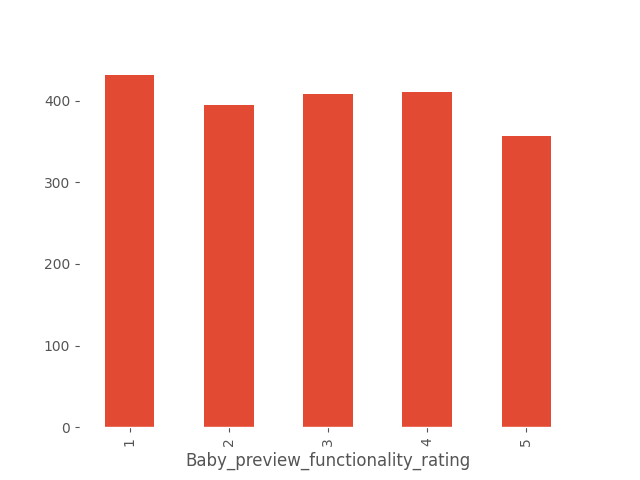

While pregnancy planning is rated relatively positively, there is a wide range of opinions regarding the baby preview feature. This feature warrants deeper analysis. Opinions about it are ambiguous; aggregating ratings 1 and 2 as clearly negative and 4 and 5 as clearly positive shows that negative opinions prevail. It might be beneficial to conduct a more detailed survey specifically on this functionality. Another approach could be proposing different designs and conducting an A/B test to evaluate differences in page visits or time spent on the feature.
Overall, the most highly rated functionality of the application is articles, followed by pregnancy planning, while baby preview is rated the lowest.
Next, let’s analyze the questions directly related to the application’s design. We’ll create bar charts for both questions and see how users’ ratings are distributed.
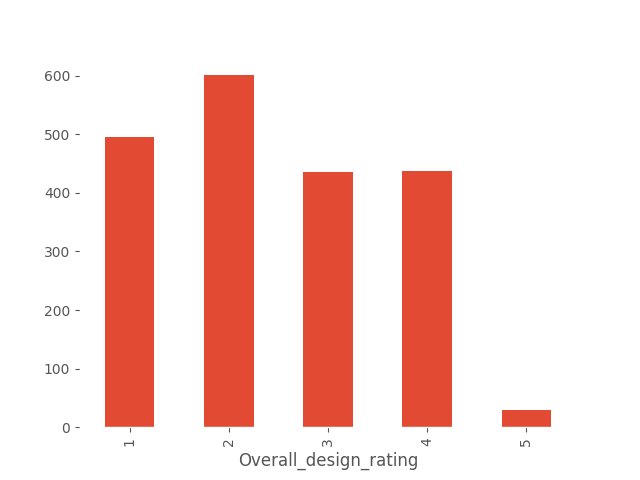
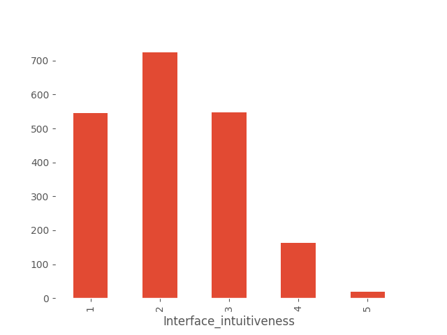
These are not good results. The application interface seems to be complicated for users. Let’s check if these ratings depend on how often users use the application. Logic suggests that an application that is used relatively well will be used more often than one that is difficult to use.
Dependent (reject H0)
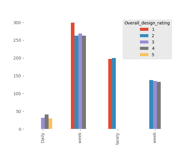
Dependent (reject H0)
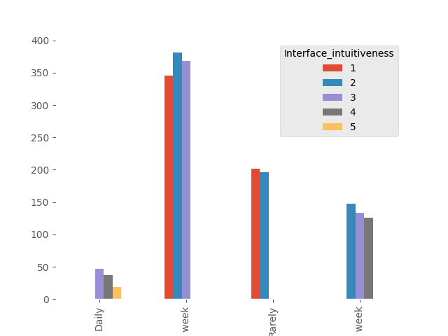
In both cases, dependency has been shown, which aligns with logical expectations. The conclusion is clear - simplifying the application interface would likely result in more frequent use by users.
Now, let’s calculate the Net Promoter Score (NPS) for our application. This score illustrates the loyalty of our application’s users by summarizing responses to a simple question: “Would you recommend our application to others?” Users selecting 0-6 are detractors (unlikely to recommend), 7-8 are passive users, and 9-10 are promoters (likely to recommend to others).
nps_df = df.groupby("Recommend_to_others").size().to_frame(name="score")
total = nps_df.score.sum()
detractors = nps_df[nps_df.index < 8].score.sum()
passive = nps_df[nps_df.index.isin([7, 8])].score.sum()
promoters = nps_df[nps_df.index > 8].score.sum()

nps = (promoters - detractors) / total
nps
The result is -0.5135, which is extremely poor and indicates that the application has significantly more detractors than promoters.
This NPS score suggests a critical need for improvement in user satisfaction and advocacy. It would be crucial to address the usability issues identified in the design and interface ratings to enhance user experience and potentially increase user recommendations.
The last items to check are the open-ended questions. There are issues with them as we messed up. Since I know exactly what problems exist, I need to write a reverse function to solve them using regular expressions and standard code.
import re

def restore_text(text):
  # Remove double spaces
  text = re.sub(r' {2,}', ' ', text)

  # Convert entire text to lowercase
  text = text.lower()

  # Remove repeated characters, but not for valid double letters
  text = re.sub(r'([a-z])\1{2,}', r'\1', text)  # three or more repeated characters
  text = re.sub(r'([a-z])\1', r'\1', text)  # two repeated characters

  # Replace similar looking letters
  text = text.replace('3', 'e')
  text = text.replace('@', 'a')

  return text
Apply the function to non-empty values of improvement suggestions and then display a specific ranking.
df_improvement_suggestions = df.Improvement_suggestions.dropna().apply(lambda x: restore_text(x)).to_frame(name="suggestion")

df_improvement_suggestions.groupby("suggestion").size().sort_values(ascending=False)
suggestion
more interactive features       116
better graphics                 106
more articles                   103
faster load times                98
less ads                         71
more frequent updates            23
more language options            22
improve navigation               20
more videos                      17
customizable themes              17
additional content categories    14
better notifications             11
better graphics                   1
more articles                     1
faster load times                 1
customizable themes               1
more interactive features         1
As you can see, there are still some text processing issues. Normally, after initial processing, it’s worthwhile to address the most common error cases. Here, with relatively little data, it’s clear that users primarily want more interactive features, better graphics, more articles (which also addresses the question of whether there are too many), faster performance, and fewer advertisements.
The same needs to be done for the question about new features.
feature
exercise routines                118
diet plans                       116
community forums                 105
daily tips                        90
expert Q&A sessions               61
recipe suggestions                47
mental health resources           22
better calendar integration       21
tracking multiple pregnancies     18
offline access                    12
partner support tips              12
daily tips                         1
exercise routines                  1
mental health resources            1
mental health resources            1
Users are most interested in having exercise plans, diet plans, community forums, and daily tips introduced.
Using the information from both open-ended questions, it is necessary to consider and plan improvements and new functionalities to be introduced into the application.
Summary
We have efficiently gone through the survey results. Here are the conclusions I would convey to those responsible for developing the pregnancy assistance application:
-
The vast majority of app users only use it once a week. Subsequently, usage proportions are roughly equal between those who use the app less frequently or multiple times a week. Very few users visit the app daily. It is worth considering how to reverse this trend.
-
Articles are the most important functionality overall, driven partly by the fact that most respondents are currently in the second trimester of pregnancy. The study revealed a correlation between pregnancy trimester and the importance placed on specific functionalities: planning is crucial for first-trimester users, while baby preview is key for those in the final trimester.
-
Users are relatively satisfied with the functionality of articles and pregnancy planning. However, there is no clear satisfaction with the baby preview feature. Further investigation into this area is warranted.
-
The most popular category is “Baby”. Generally, most categories are popular, but there are a few with poor ratings, such as “Science”. It is advisable to examine whether the layout of article categories in the app interface affects their popularity. At this point, I would not recommend reducing the number of categories; user feedback from open-ended questions indicates a desire to expand the article base.
-
Users are dissatisfied with the overall design of the app. The interface and navigation are perceived as complex. There is a demonstrated correlation between design ratings and app visit frequency—simplifying the app interface could potentially increase user engagement.
-
The Net Promoter Score is at a dismal level, indicating that the app is not recommended by users. A deeper analysis is needed to address this situation effectively.
-
Regarding improvements, users primarily desire more interactive features, better graphics, more articles (which also addresses whether there are too many), faster performance, and fewer advertisements.
-
Users express a strong interest in features such as exercise plans, diet plans, community forums, and daily tips.
The survey served as an initial exploration. Based on these findings, a series of next steps can be planned.
I hope this brief summary proves valuable. Until next time!