GrandPrix Circus - authentication and settings
Introduction
Hello, in this post I will create authentication and settings features for the mobile app. I start with them because some actions in the application will behave differently based on the authentication status. I will use Firebase for the authentication and the shared preferences for settings. Settings will be just the app color and mode theming. I won’t cover the process of adding the Firebase to the Flutter project, you can read about it here. For the state management, I will use the Riverpod. It will be rather a short post.
Let’s get to work!
Settings
The first thing to do is create a provider. I usually make the providers.dart in the core directory of the project, which will keep the code for the commonly used providers. My simple application will contain the providers for shared preferences, Dio, and Firebase utilities.
@riverpod
SharedPreferences sharedPreferences(SharedPreferencesRef ref) {
  throw UnimplementedError();
}
If you have read my series about the Dogly app you know that the value of the provider will be overridden at the application startup, because it is not immediately available. You can read more about dependency overrides here. It looks like this in the main.dart file:
  WidgetsFlutterBinding.ensureInitialized();
  final sharedPreferences = await SharedPreferences.getInstance();
  runApp(
    ProviderScope(
      overrides: [
        sharedPreferencesProvider.overrideWithValue(sharedPreferences),
      ],
      child: const MainApp(),
    ),
  );
}
Let’s also create the repository for communicating with shared prefs.
@riverpod
SharedPrefsAPI sharedPrefsAPI(SharedPrefsAPIRef ref) {
  return SharedPrefsAPI(
      sharedPreferences: ref.watch(sharedPreferencesProvider));
}

abstract class ISharedPrefsAPI {
  bool isDarkMode();
  Future<void> setDarkMode(bool mode);
  String getColorMode();
  Future<void> setColorMode(String color);
}

class SharedPrefsAPI implements ISharedPrefsAPI {
  final SharedPreferences _sharedPreferences;

  SharedPrefsAPI({required SharedPreferences sharedPreferences})
      : _sharedPreferences = sharedPreferences;

  @override
  String getColorMode() {
    return _sharedPreferences.getString('colorMode') ?? '#00ff00';
  }

  @override
  bool isDarkMode() {
    return _sharedPreferences.getBool('darkMode') ?? false;
  }

  @override
  Future<void> setColorMode(String color) {
    return _sharedPreferences.setString('colorMode', color);
  }

  @override
  Future<void> setDarkMode(bool mode) {
    return _sharedPreferences.setBool('darkMode', mode);
  }
}
It has 4 simple methods for getting and setting the mode or theme. At the top of the file, you can notice the abstract interface provider for the repo class. I won’t change the implementation of this API, but I consider creating the abstract interfaces a good practice.
The application needs two controllers - state notifier providers for managing the changes in the theme and mode. They are pretty simple also:
@riverpod
class ColorModeController extends _$ColorModeController {
  late SharedPrefsAPI _sharedPreferencesAPI;

  @override
  String build() {
    _sharedPreferencesAPI = ref.watch(sharedPrefsAPIProvider);
    return _sharedPreferencesAPI.getColorMode();
  }

  void change(String color) {
    state = color;
    _sharedPreferencesAPI.setColorMode(state);
  }
}
@riverpod
class DarkModeController extends _$DarkModeController {
  late SharedPrefsAPI _sharedPreferencesAPI;

  @override
  bool build() {
    _sharedPreferencesAPI = ref.watch(sharedPrefsAPIProvider);
    return _sharedPreferencesAPI.isDarkMode();
  }

  void toggle() {
    state = !state;
    _sharedPreferencesAPI.setDarkMode(state);
  }
}
Both initiates with the current state stored in the shared preferences and can change it using a method.
Now let’s take a look at the settings view. I use the settings_ui package to quickly build this view.
class SettingsView extends ConsumerWidget {
  const SettingsView({super.key});

  @override
  Widget build(BuildContext context, WidgetRef ref) {
    final darkMode = ref.watch(darkModeControllerProvider);
    return Scaffold(
        appBar: AppBar(
          title: const Text('Settings 🛠️'),
        ),
        body: SettingsList(
          sections: [
            SettingsSection(
              title: const Text('Appearance'),
              tiles: [
                SettingsTile.navigation(
                  leading: const Icon(Icons.color_lens),
                  title: const Text('Color theme'),
                  value: Text(getKeyByValue(colorMode, UIConstants.colorsMap)),
                  onPressed: (BuildContext context) {
                    Navigator.push(
                        context,
                        MaterialPageRoute(
                            builder: (BuildContext context) =>
                                const ChooseColorView()));
                  },
                ),
                SettingsTile.switchTile(
                  title: const Text('Dark mode'),
                  leading: const Icon(Icons.dark_mode),
                  initialValue: darkMode,
                  onToggle: (val) {
                    ref.read(darkModeControllerProvider.notifier).toggle();
                  },
                ),
              ],
            )
          ],
        ));
  }
}
It watches for changes in the controllers I created in the step before. There is a switch tile to change between the dark and light modes. It triggers the toggle method from the controller. The color theme tile navigates to the other view, which is created in the following way:
import 'package:flutter/material.dart';
import 'package:grand_prix_circus/commons/ui_constants.dart';
import 'package:grand_prix_circus/presentation/settings/widgets/color_tile.dart';

class ChooseColorView extends StatelessWidget {
  const ChooseColorView({Key? key}) : super(key: key);

  @override
  Widget build(BuildContext context) {
    return Scaffold(
      appBar: AppBar(
        title: const Text('Themes 🎨'),
      ),
      body: Column(
        children: [
          const Row(
            mainAxisAlignment: MainAxisAlignment.center,
            children: [
              Text('Choose your favourite color theme'),
            ],
          ),
          const SizedBox(
            height: 16,
          ),
          Padding(
            padding: const EdgeInsets.all(8.0),
            child: Row(
              mainAxisAlignment: MainAxisAlignment.spaceBetween,
              children: UIConstants.colorsMap.entries.map((e) {
                return ColorTile(color: e.value, labelText: e.key);
              }).toList(),
            ),
          )
        ],
      ),
    );
  }
}
It is just a static widget, not a consumer one. The Riverpod widget is a ColorTile:
import 'package:flutter/material.dart';
import 'package:flutter_riverpod/flutter_riverpod.dart';
import 'package:grand_prix_circus/commons/utils.dart';
import 'package:grand_prix_circus/presentation/settings/controllers/color_mode_controller.dart';

class ColorTile extends ConsumerStatefulWidget {
  final String color;
  final String labelText;

  const ColorTile({Key? key, required this.color, required this.labelText})
      : super(key: key);

  @override
  ConsumerState<ConsumerStatefulWidget> createState() => _ColorTileState();
}

class _ColorTileState extends ConsumerState<ColorTile> {
  bool isHighlighted = false;

  void handleTap() {
    if (isHighlighted) {
      return;
    }

    setState(() {
      isHighlighted = !isHighlighted;
    });
    ref.read(colorModeControllerProvider.notifier).change(widget.color);
  }

  @override
  Widget build(BuildContext context) {
    final currentAppTheme = ref.watch(colorModeControllerProvider);

    if (currentAppTheme == widget.color) {
      setState(() {
        isHighlighted = true;
      });
    } else {
      setState(() {
        isHighlighted = false;
      });
    }

    Color circleColor = stringToColor(widget.color);

    return GestureDetector(
      onTap: () => handleTap(),
      child: Column(
        children: [
          Container(
            width: 60,
            height: 50,
            decoration: BoxDecoration(
              color: isHighlighted
                  ? circleColor.withOpacity(0.2)
                  : circleColor.withOpacity(0.1),
              borderRadius: BorderRadius.circular(10),
              border: Border.all(
                  width: 2.0,
                  color: isHighlighted
                      ? circleColor
                      : circleColor.withOpacity(0.5)),
            ),
            child: Center(
              child: Container(
                width: 15,
                height: 15,
                decoration: BoxDecoration(
                  color: circleColor,
                  shape: BoxShape.circle,
                ),
              ),
            ),
          ),
          Text(widget.labelText),
        ],
      ),
    );
  }
}
It displays five colorful rectangles with rounded corner tiles with a circle inside. It watches for the color controller state and triggers its change method on click. The widget has also a state that indicates if it is chosen and should be highlighted.
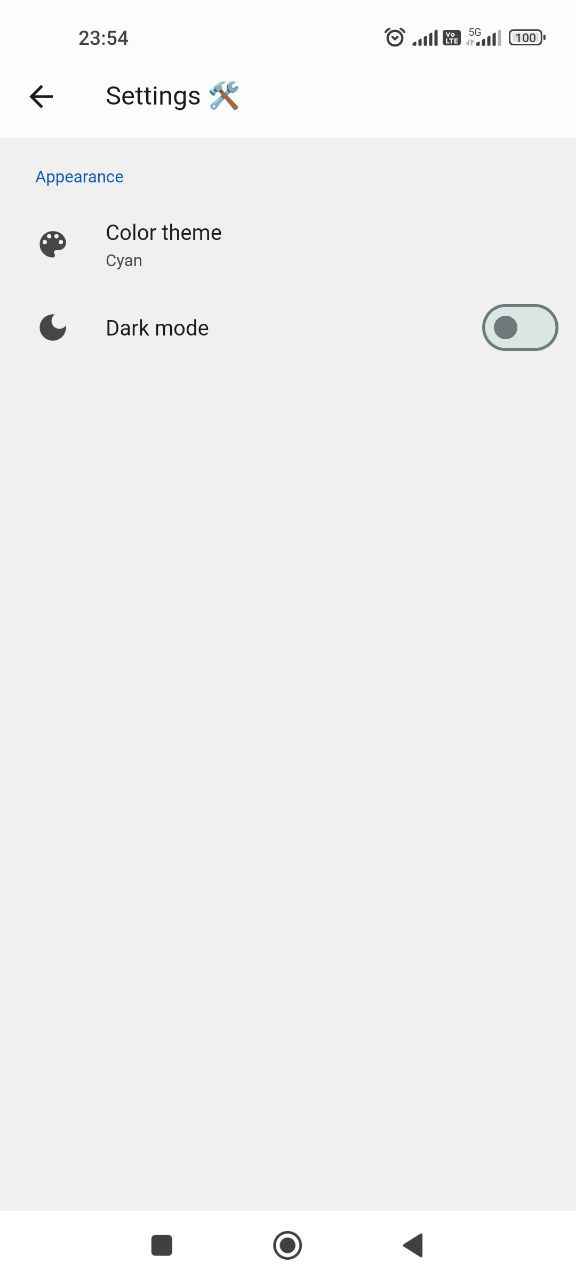
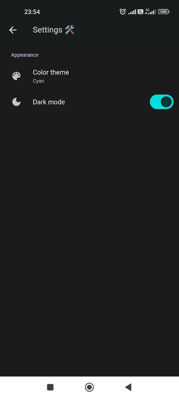
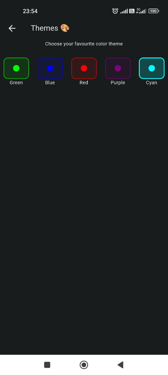
The application should also have a knowledge of what theme and mode to use, so the main widget also watches for the changes in the providers and decides what theme should be used at the startup or rebuilds on changes.
class MainApp extends ConsumerWidget {
  const MainApp({super.key});

  @override
  Widget build(BuildContext context, WidgetRef ref) {
    final darkMode = ref.watch(darkModeControllerProvider);
    final colorMode = ref.watch(colorModeControllerProvider);

    return MaterialApp(
      title: 'Grand Prix Circus',
      theme: ThemeData(
        useMaterial3: true,
        colorSchemeSeed: stringToColor(colorMode),
        brightness: Brightness.light,
      ),
      darkTheme: ThemeData(
        useMaterial3: true,
        colorSchemeSeed: stringToColor(colorMode),
        brightness: Brightness.dark,
      ),
      themeMode: darkMode ? ThemeMode.dark : ThemeMode.light,
      home: const HomePage(),
    );
  }
}
Authentication
Let’s start with initializing Firebase in the main function following the documentation.
Future<void> main() async {
  WidgetsFlutterBinding.ensureInitialized();

  final sharedPreferences = await SharedPreferences.getInstance();

  await Firebase.initializeApp(
    options: DefaultFirebaseOptions.currentPlatform,
  );

  runApp(
    ProviderScope(
      observers: [Logger()],
      overrides: [
        sharedPreferencesProvider.overrideWithValue(sharedPreferences),
      ],
      child: const MainApp(),
    ),
  );
}
Now the provider for the authentication utility should be added to the file in the core directory.
@Riverpod(keepAlive: true)
FirebaseAuth firebaseAuth(FirebaseAuthRef ref) => FirebaseAuth.instance;
It keeps the state alive. The providers created with code generation are autodisposable by default. It means the state of the provider is destroyed when it is no longer used. I would like to keep this state so that the user is not logged out when closes the app.
I will use the authentication screen provided by Firebase, so my AuthAPI class is used only for getting current users or informing about the state changes.
class AuthAPI {
  final FirebaseAuth _auth;

  AuthAPI({required FirebaseAuth auth}) : _auth = auth;

  Stream<User?> authStateChanges() => _auth.authStateChanges();
  User? get currentUser => _auth.currentUser;
}

@Riverpod(keepAlive: true)
AuthAPI authAPI(AuthAPIRef ref) {
  return AuthAPI(auth: ref.watch(firebaseAuthProvider));
}
The last thing to do is create views. The application should have a login/registration form and some user profile screen with the possibility to edit data or delete an account. Luckily the Firebase provides two already-created views. They are not the prettiest, but for my usage will be enough.
The tricky thing is that the signing screen requires a provider, but not the Riverpod one. It needs the Firebase authentication method provider. So I created a provider for this provider:
@Riverpod(keepAlive: true)
List<AuthProvider<AuthListener, AuthCredential>> authProviders(
    AuthProvidersRef ref) {
  return [
    EmailAuthProvider(),
  ];
}
The sign-in view is a consumer widget. It watches for changes in the provider created above. It also reacts to the auth state change action. It simply pops the screen off when the user logs in or registers.
class CustomSignInView extends ConsumerWidget {
  const CustomSignInView({super.key});

  @override
  Widget build(BuildContext context, WidgetRef ref) {
    final authProviders = ref.watch(authProvidersProvider);
    return Scaffold(
      appBar: AppBar(
        title: const Text('Account 📝'),
      ),
      body: SignInScreen(
        providers: authProviders,
        actions: [
          AuthStateChangeAction((context, state) {
            Navigator.of(context).pop();
          })
        ],
      ),
    );
  }
}
The profile screen view is pretty similar. It reacts when the user triggers a sign out action.
import 'package:firebase_ui_auth/firebase_ui_auth.dart';
import 'package:flutter/material.dart';
import 'package:flutter_riverpod/flutter_riverpod.dart';
import 'package:grand_prix_circus/presentation/auth/providers/auth_providers.dart';

class CustomProfileView extends ConsumerWidget {
  const CustomProfileView({super.key});

  @override
  Widget build(BuildContext context, WidgetRef ref) {
    final authProviders = ref.watch(authProvidersProvider);
    return ProfileScreen(
      appBar: AppBar(
        title: const Text('Account 📝'),
      ),
      actions: [
        SignedOutAction((context) {
          Navigator.of(context).pop();
        }),
      ],
      providers: authProviders,
    );
  }
}
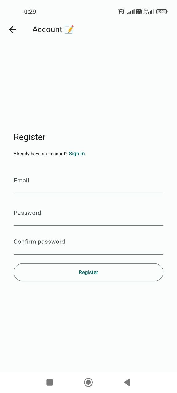
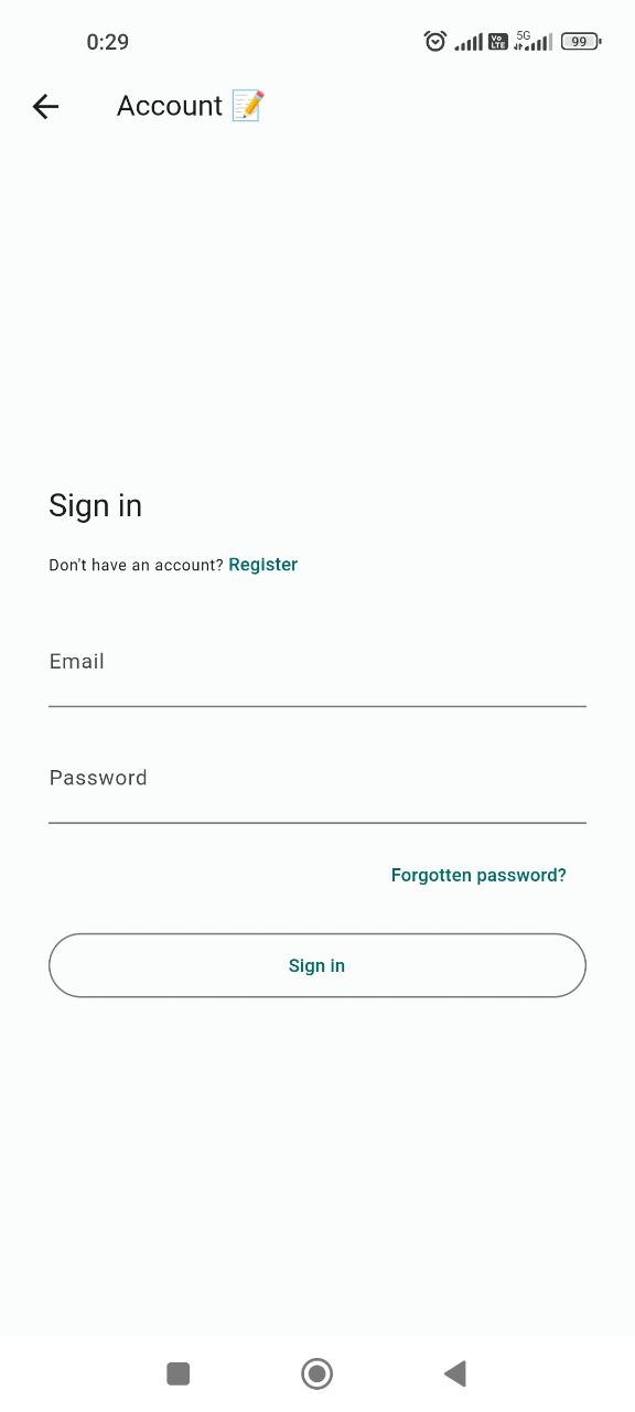
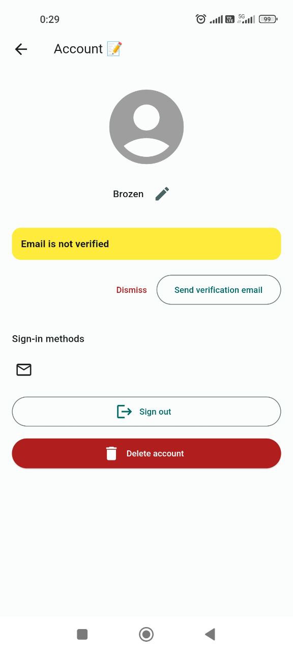
I know that the user profile view does not have a good design and also uses features I do not need - for example email verification. In the official product, I would create a user profile screen on my own, for example I did it for the Dogly app.
The user can access the user profile view from the navigation drawer, which is created like this:
class MyNavDrawer extends ConsumerWidget {
  final List<Map<String, dynamic>> pages;

  const MyNavDrawer({super.key, required this.pages});

  @override
  Widget build(BuildContext context, WidgetRef ref) {
    final currentUser = ref.watch(authAPIProvider).currentUser;
    return SizedBox(
      width: MediaQuery.of(context).size.width * 0.5,
      child: Drawer(
        child: ListView(
          children: [
            currentUser == null
                ? DrawerHeader(
                    child: CommonButton(
                      onTap: () {
                        Navigator.pop(context);
                        Navigator.push(
                            context,
                            MaterialPageRoute(
                                builder: (BuildContext context) =>
                                    const CustomSignInView()));
                      },
                      label: "Sign in!",
                    ),
                  )
                : UserAccountsDrawerHeader(
                    currentAccountPicture: const CircleAvatar(
                      backgroundImage: AssetImage('assets/icon/icon.jpg'),
                    ),
                    accountName: Text(currentUser.displayName ?? ""),
                    accountEmail: Text(currentUser.email!),
                    onDetailsPressed: () {
                      Navigator.pop(context);
                      Navigator.push(
                          context,
                          MaterialPageRoute(
                              builder: (BuildContext context) =>
                                  const CustomProfileView()));
                    },
                  ),
            ...pages.map((page) {
              final Widget pageWidget = page['page'];
              final Widget icon = page['icon'];
              final String title = page['title'];
              return ListTile(
                  leading: icon,
                  title: Text(title),
                  onTap: () {
                    Navigator.pop(context);
                    Navigator.push(
                        context,
                        MaterialPageRoute(
                            builder: (BuildContext context) => pageWidget));
                  });
            }),
            const AboutListTile(
              icon: Icon(Icons.info),
              applicationName: UIConstants.appName,
              applicationVersion: UIConstants.appVersion,
              aboutBoxChildren: [
                SizedBox(
                  height: 8,
                ),
                Text(
                  'A simple app with news and memes about Formula 1 🏁',
                  style: TextStyle(fontSize: 12),
                )
              ],
              applicationLegalese: UIConstants.appCompany,
              child: Text('About'),
            ),
          ],
        ),
      ),
    );
  }
}
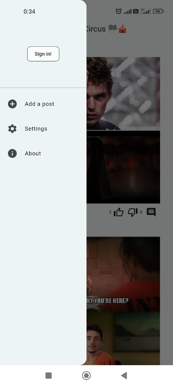
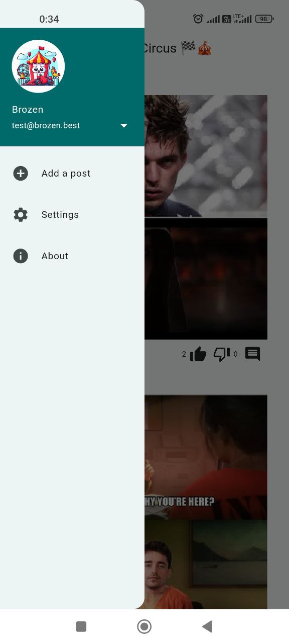
It checks if there is a user (if a user is not authenticated the provider returns null) and renders a sign-in button or user account header.
Do not forget to generate the code!
dart run build_runner build
Conclusion
Creating a simple setting for theming and authentication was a simple task for me because I already did this for my previous app - Dogly. The Firebase is quite easier to implement than the Appwrite. However I would stick to the open-source in the next projects, the Firebase is just good to know for me. In the next post, I will create the infinite scroll view with the posts. Cya!